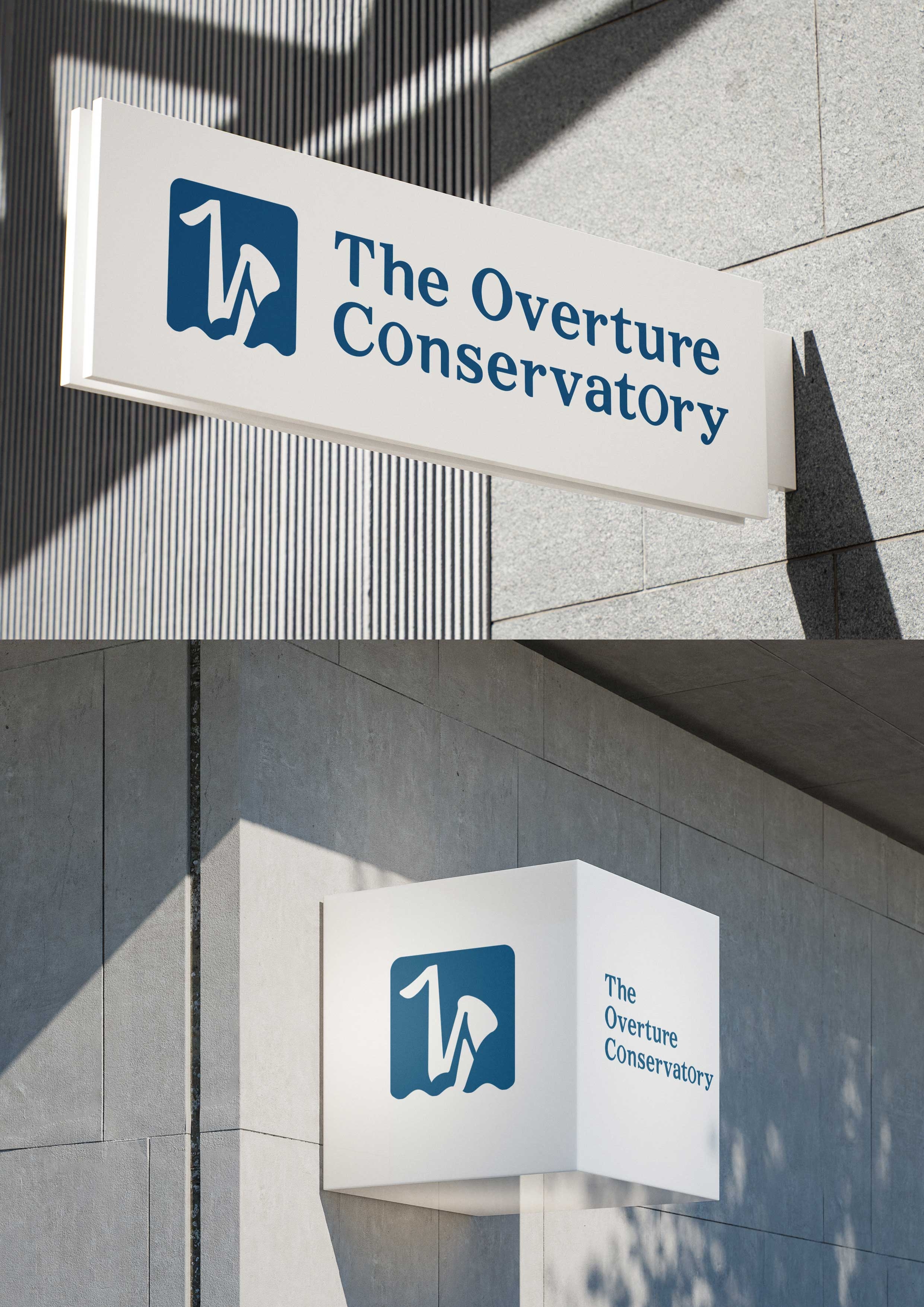
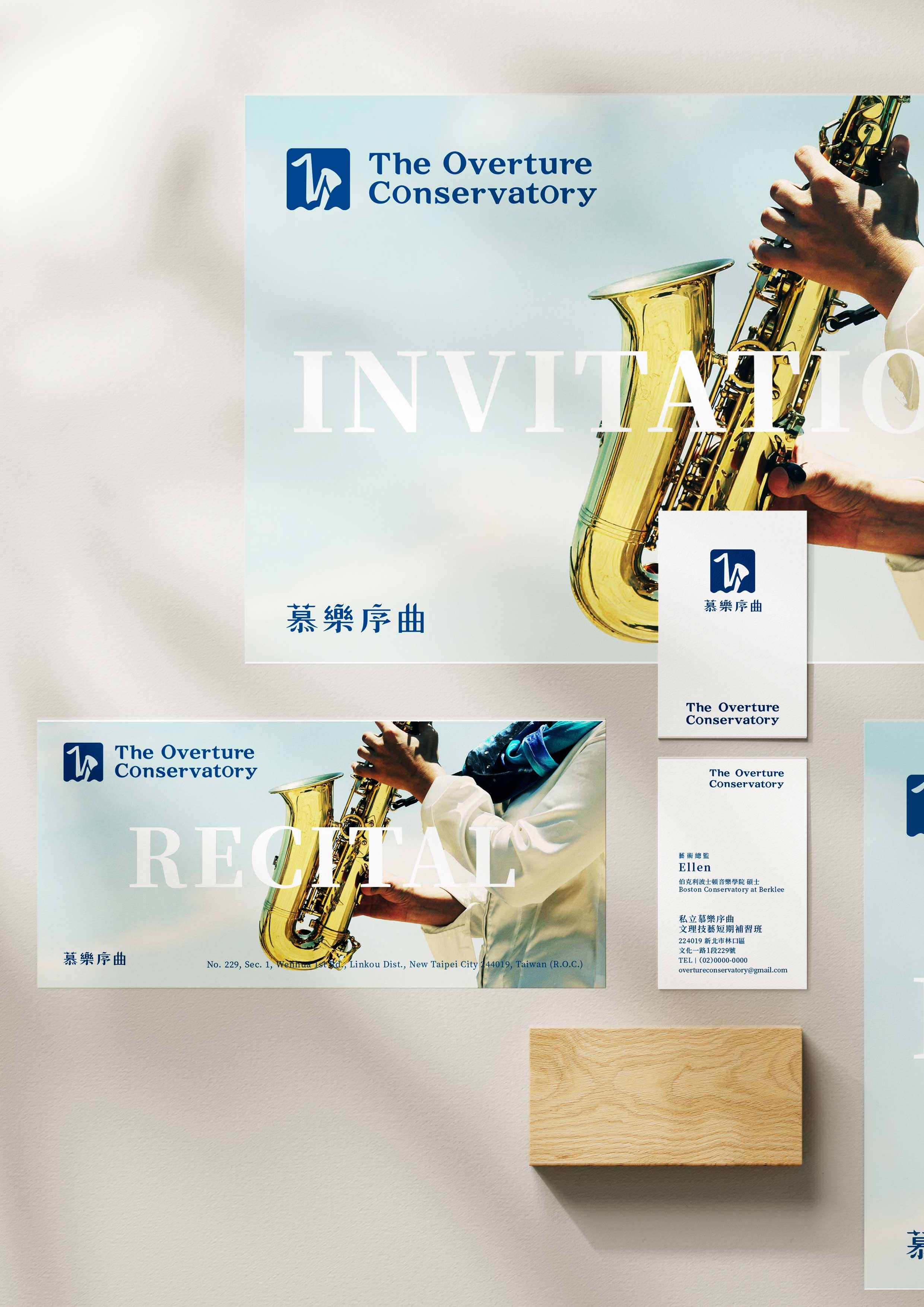
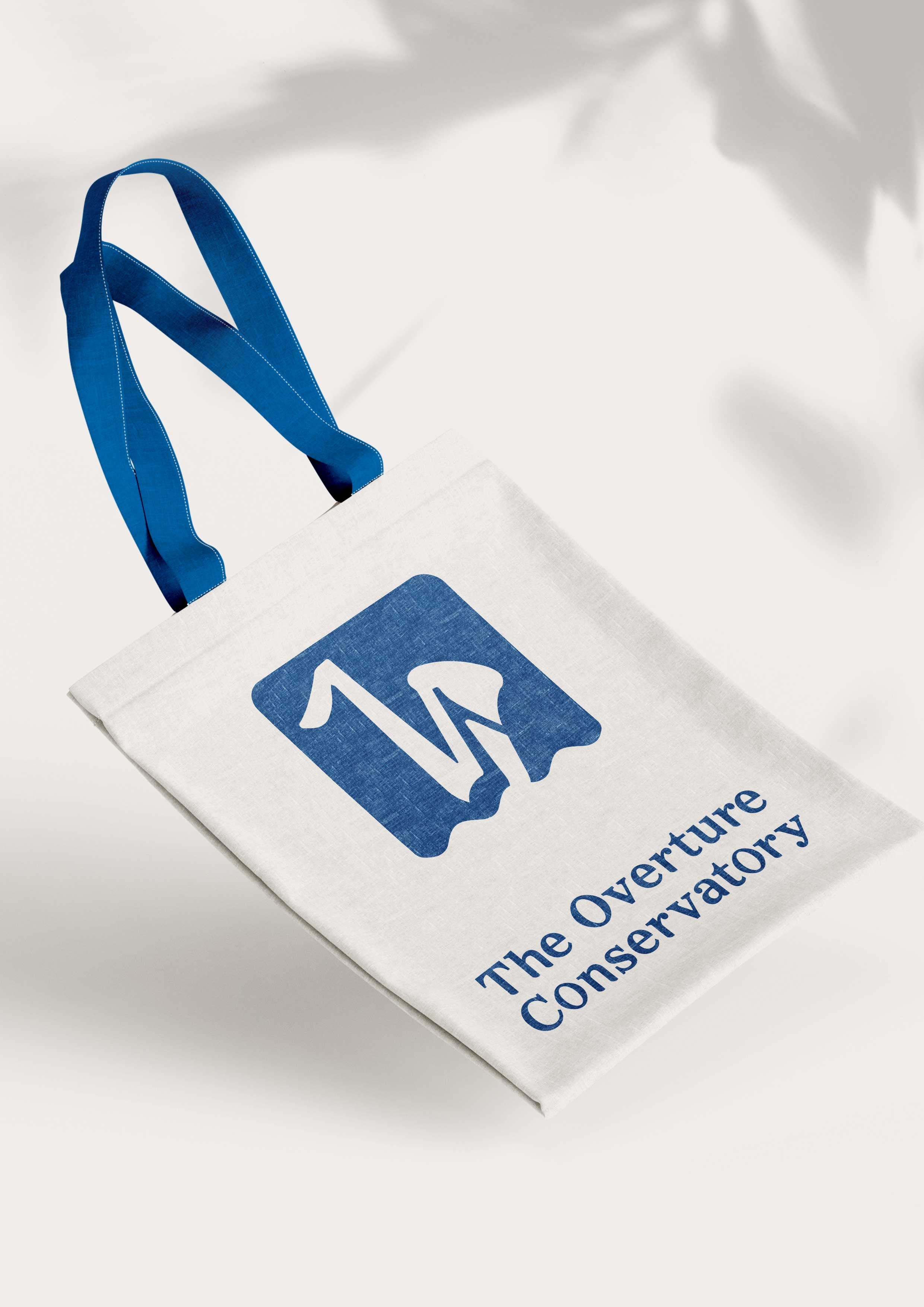
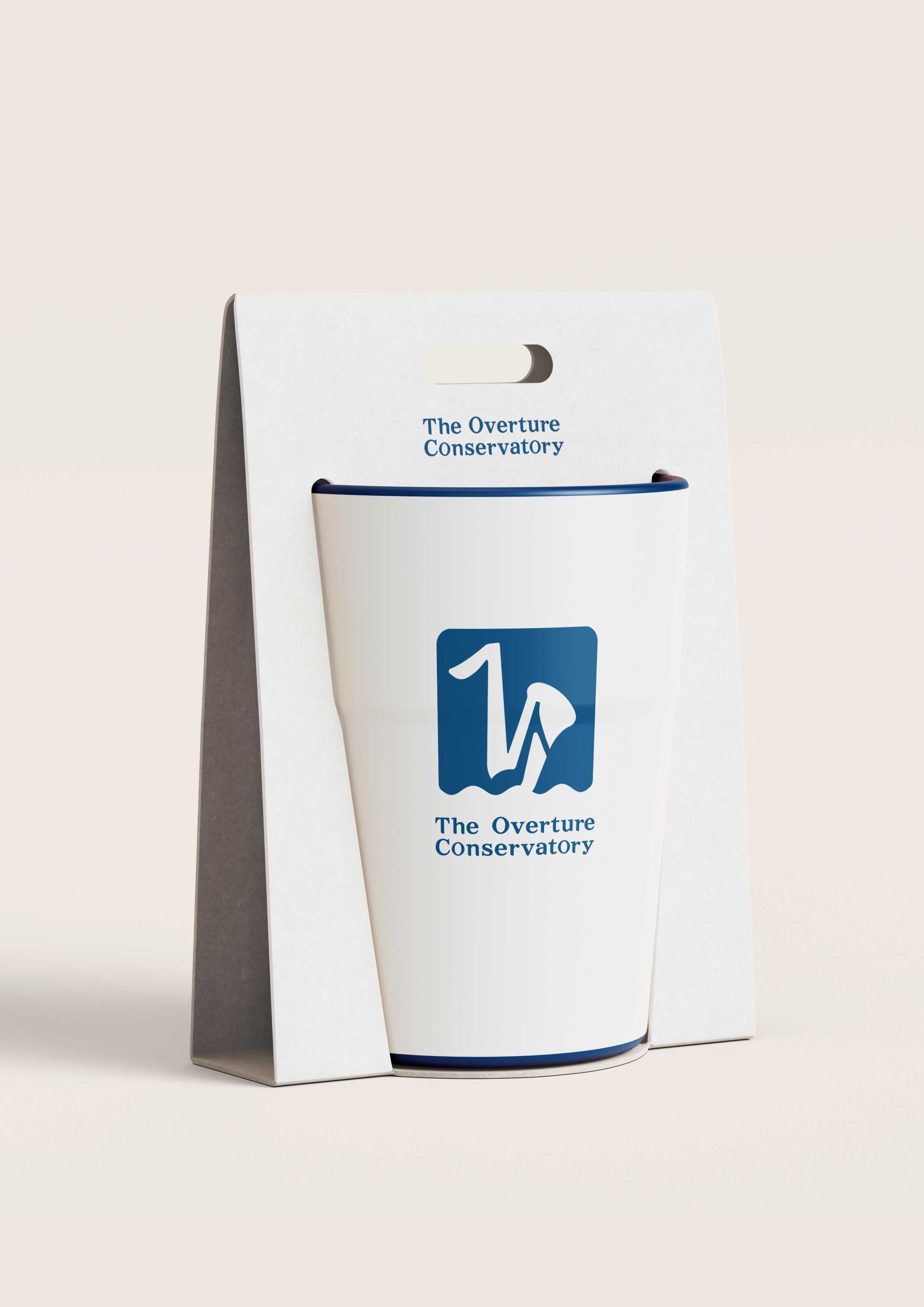
本案我們為品牌定調全套視覺識別設計,涵蓋商標、標準字系統、以及相關視覺應用系統,為業主品牌建立明確且具延展性的視覺性格。
品牌主畢業於Boston Conservatory at Berklee,主修薩克斯風並取得碩士學位,其國際化的音樂養成背景,成為我們制定設計策略時的重要指標。
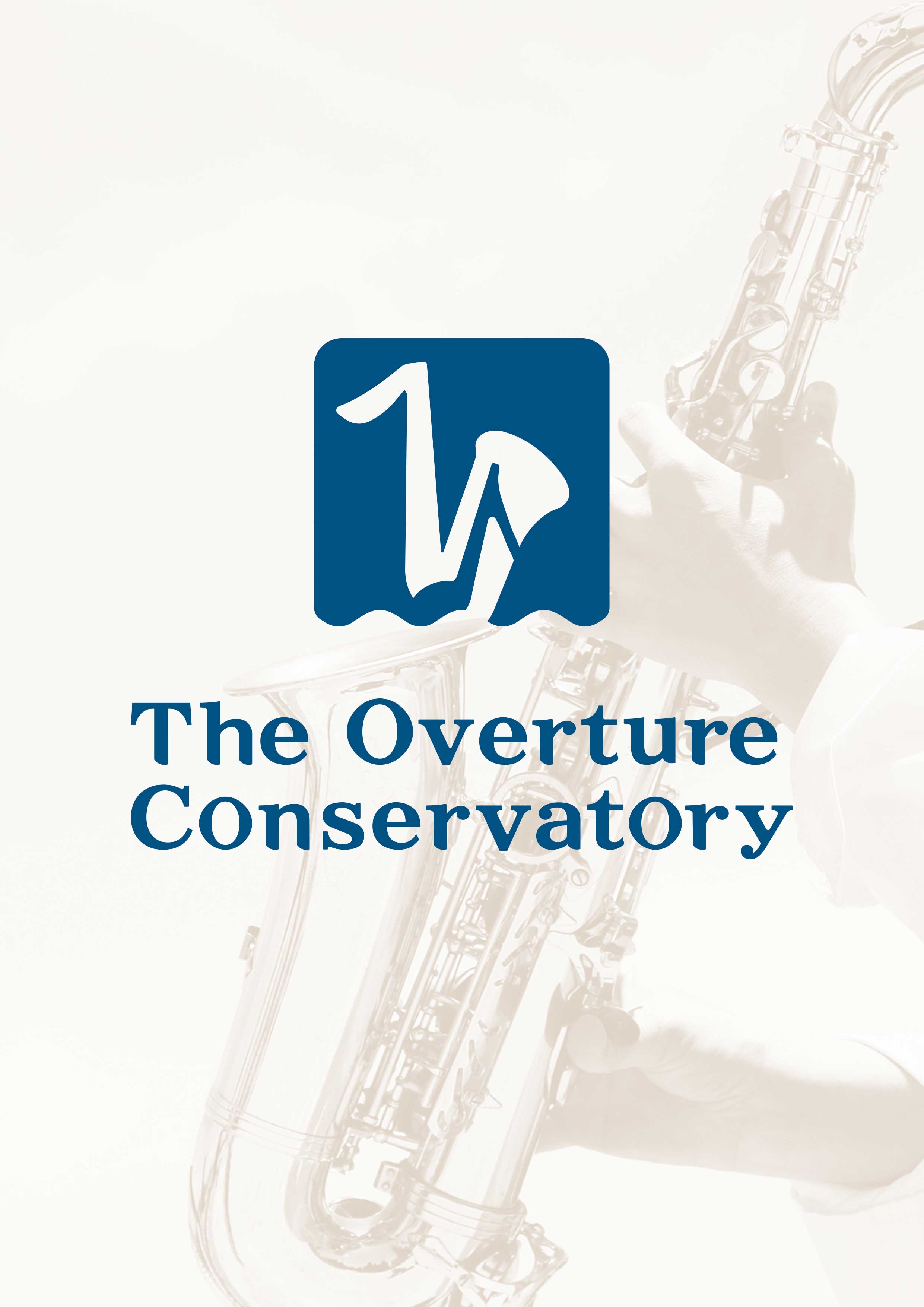
我們以「簡潔且直覺」的溝通方式,將薩克斯風的優雅輪廓精妙地融合於音符線條中。這不僅令人一眼識別品牌特色,更象徵著音樂與演奏的高度和諧。
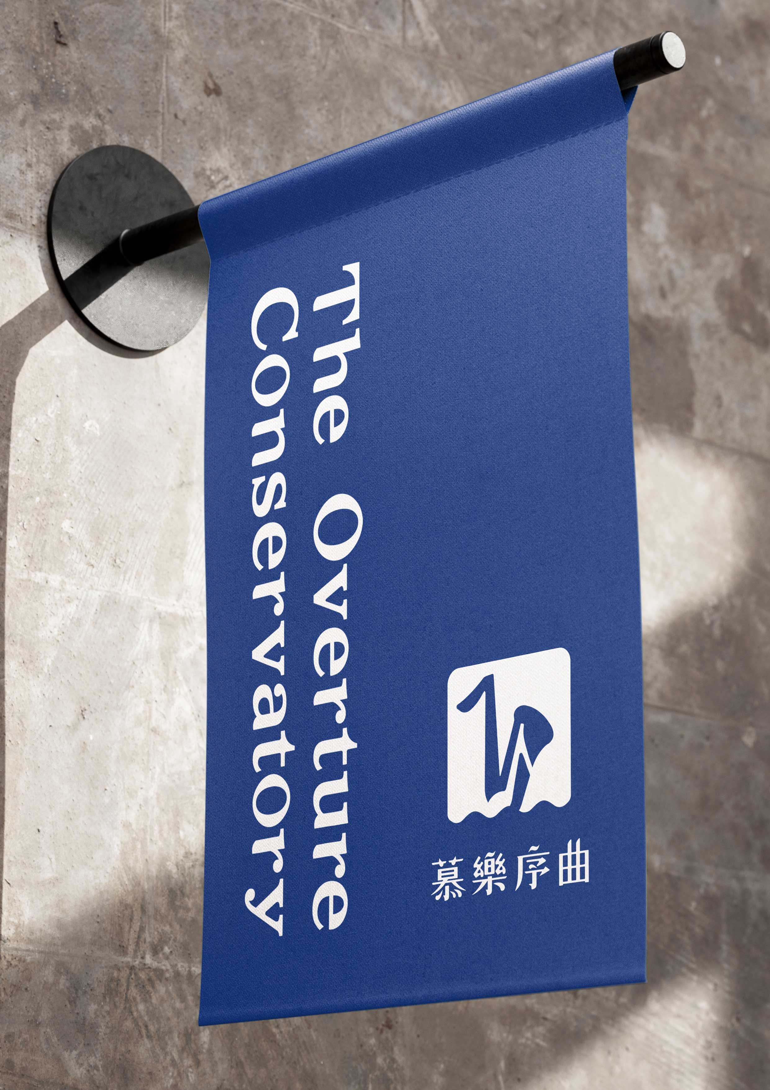
在中英文字體上,我們為「慕樂序曲The Overture Conservatory」量身打造專屬中英文標準字體。設計概念以「現代古典」為基調,確保品牌具備經典的優雅與新穎的時代感。
合作過程中,我們充分感受到品牌主對於音樂的堅持,以及對於美感細節的高度要求。這套視覺設計,正是在這種真誠的合作過程中誕生,並為同樣重視專業與品質的每一位學員而打造。
感謝業主信任。
This project involved defining a complete visual identity system for the brand, including the logo, typography system, and related visual applications, establishing a clear and extensible visual character.
The client is a saxophonist who graduated from Boston Conservatory at Berklee with a master’s degree. Their international musical background served as an important reference in shaping our design strategy.
Adopting a language of clarity and intuition, we integrated the elegant silhouette of the saxophone into the structure of musical notation. This approach allows the brand to be instantly recognizable, while expressing a strong sense of harmony between music and performance.
For typography, we designed custom Chinese and English type systems for The Overture Conservatory. Guided by the concept of modern classicism, the typographic system balances timeless elegance with a contemporary sensibility, ensuring refinement and long-term relevance.
Throughout the collaboration, we experienced the client’s strong commitment to music and high standards for aesthetic detail. This visual identity was developed through a sincere and thoughtful partnership, and was created for students who share the same respect for professionalism and quality.
Thank you to our client for their trust.
#品牌設計 #品牌行銷 #品牌顧問 #商業空間 #包裝設計