在烘焙產業早已熟悉的視覺語彙中,
我們想創造屬於品牌的記憶點。
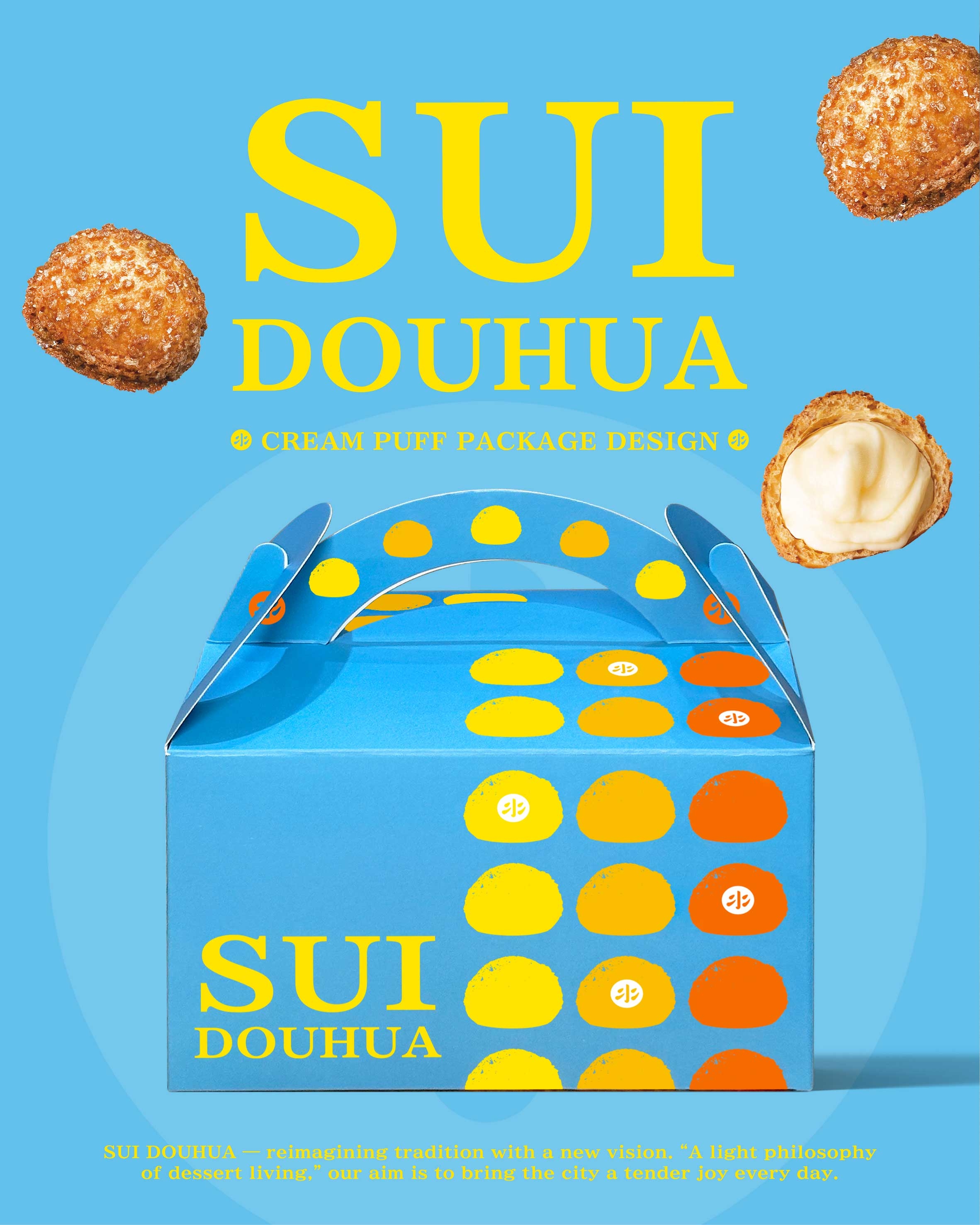
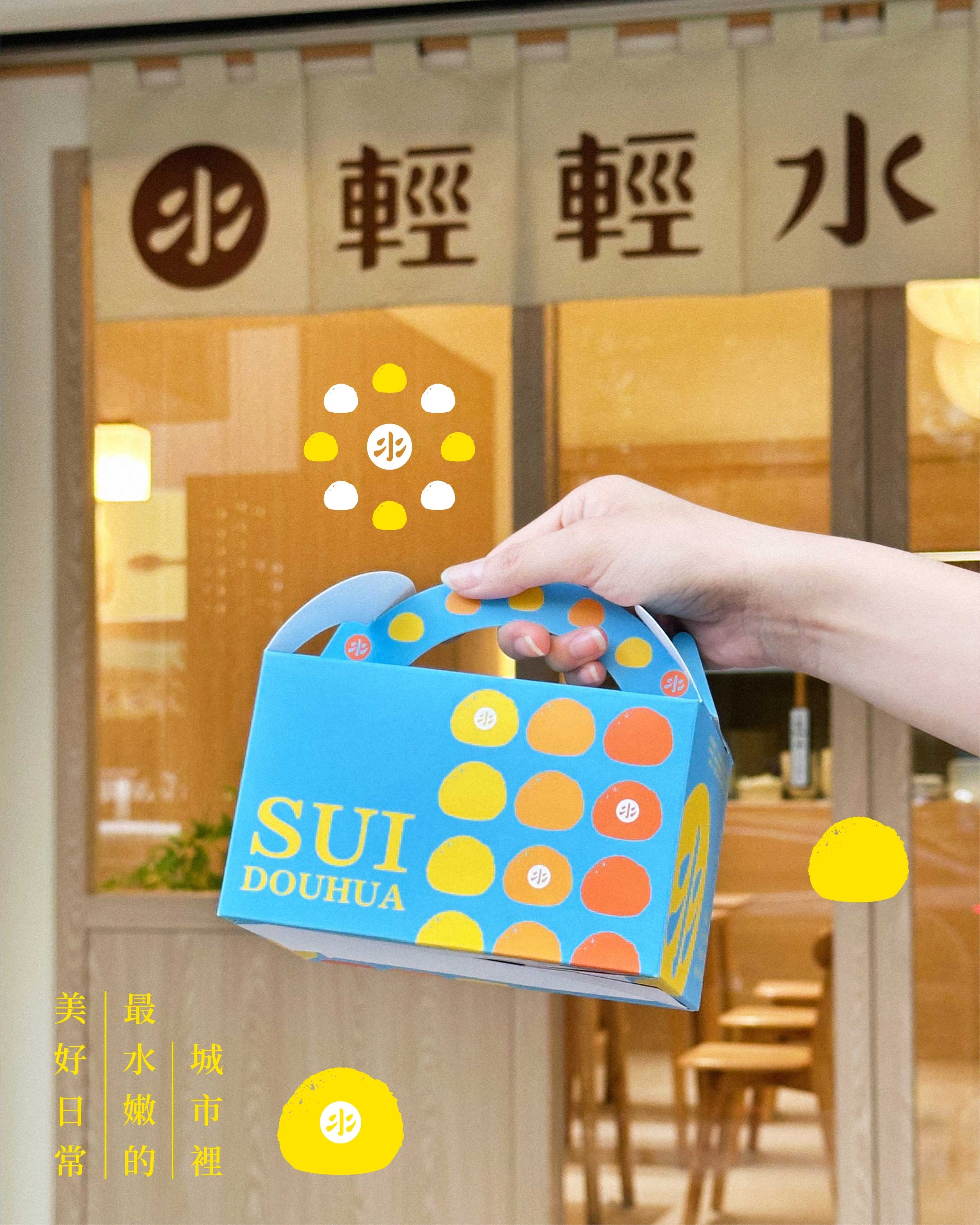
本案為烘焙點心紙盒設計,
延續「輕輕水豆花」一貫的品牌核心-
「城市裡最水嫩的美好日常」,
以溫柔、日常、親近作為出發點。
以「輕」為核心、「水」為意象,
天空藍作為主視覺基調,
搭配象徵商品核心的泡芙圖形。
透過「橘色系」的漸進式排列,
像甜點出爐的過程與溫度,
那是城市日常中緩慢流動的節奏。
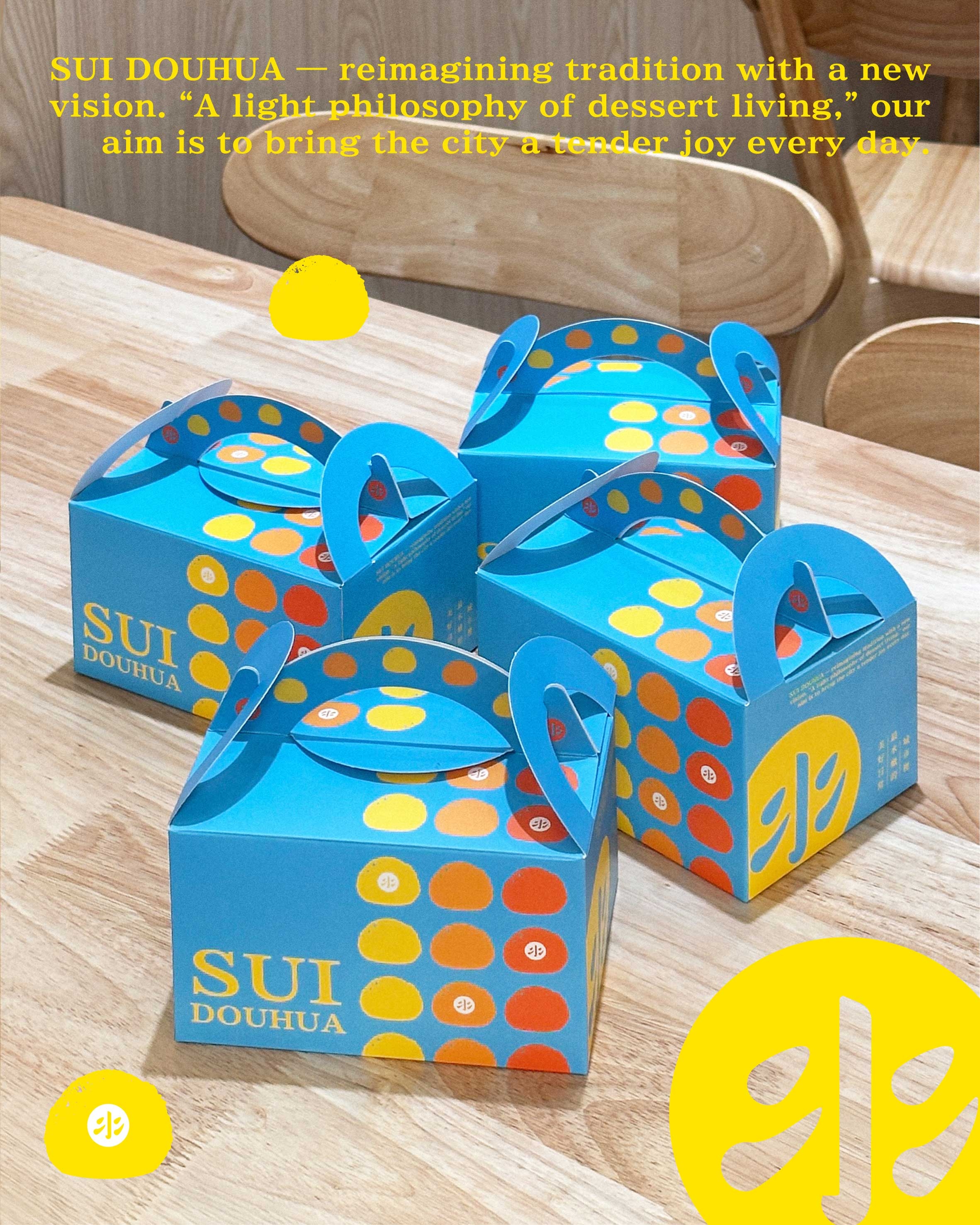
設計,是我們想在過程之中,
找到讓包裝能自然地,
被帶進城市的日常生活裡。
感謝業主信任。
Beyond the conventional visual cues of the baking industry, this project explores a new form of brand memory.
This pastry packaging continues the core essence of Lightly Soy Pudding — translating the city’s delicate moments into a tangible daily ritual.
Centered on lightness and fluidity, a sky-blue foundation meets abstracted puff iconography.
Gradual transitions of warm orange tones evoke the fleeting heat of the oven —
a steady, rhythmic pulse within the flow of urban life.
For us, design is a process of discovery :
understanding how packaging can seamlessly integrate into everyday urban routines, not as an ornament, but as a natural extension of daily life.
Gratitude to our client for the vision and trust.
#品牌設計 #品牌行銷 #品牌顧問 #商業空間 #包裝設計