品牌的進化,從來不只是形式上的更新,
而是一次對品牌精神與核心關係的重新梳理。
“每一次的蛻變,
都是為了讓彼此的關係更加緊密。”
此次 REINA 全新品牌識別設計,
我們以品牌十年的發展脈絡為基礎,
重新梳理其核心價值——
女性彼此之間的理解、支持與連結。
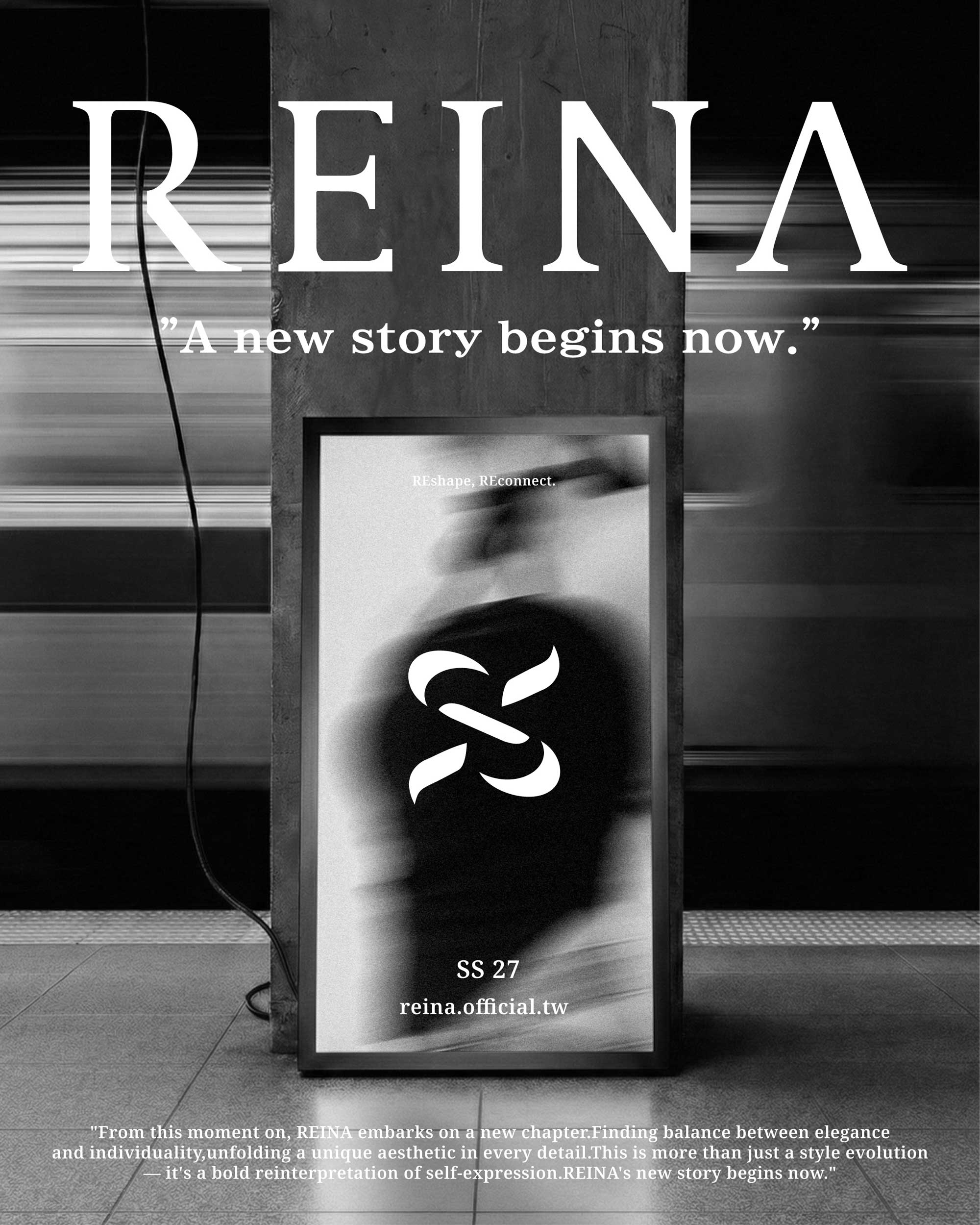
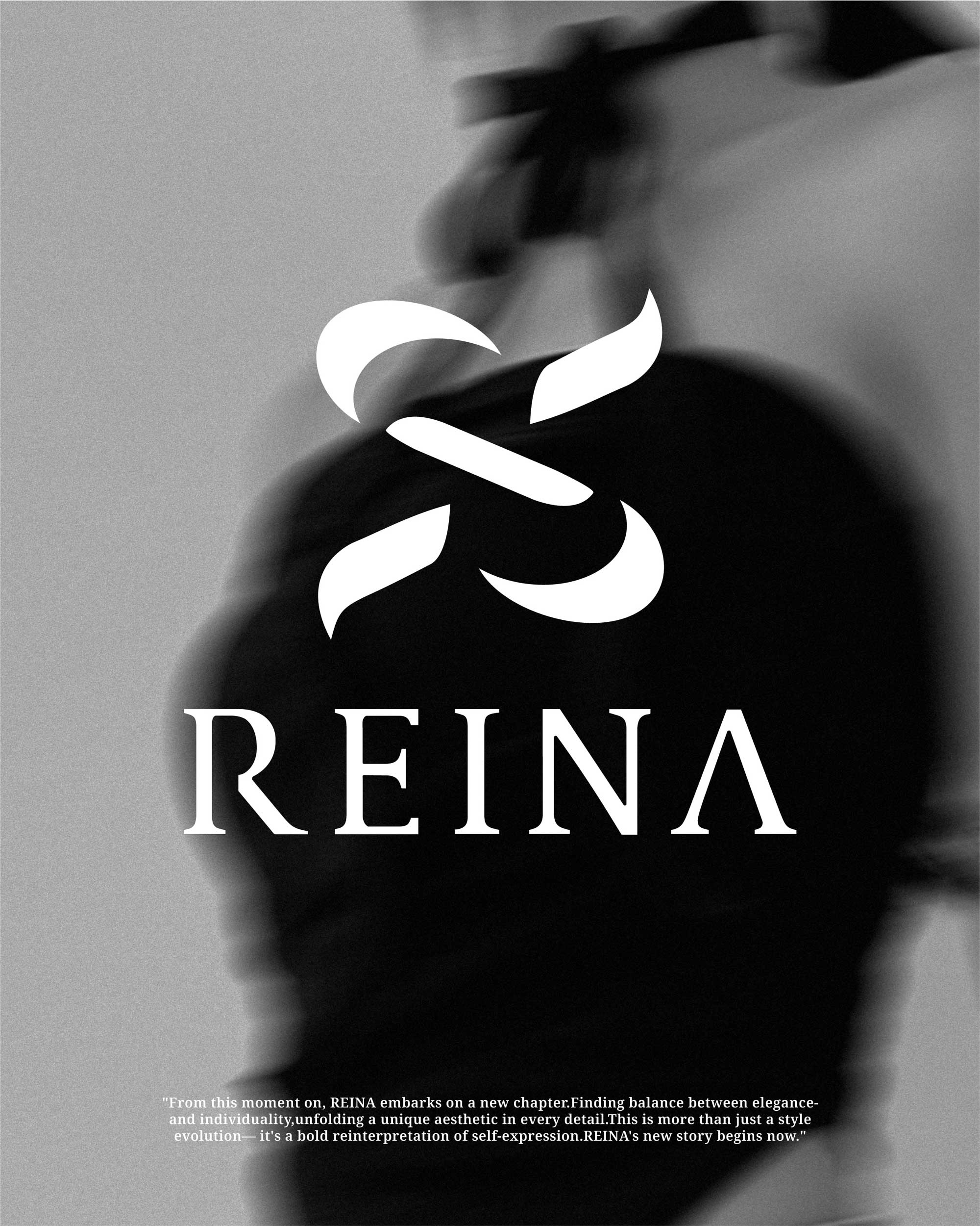
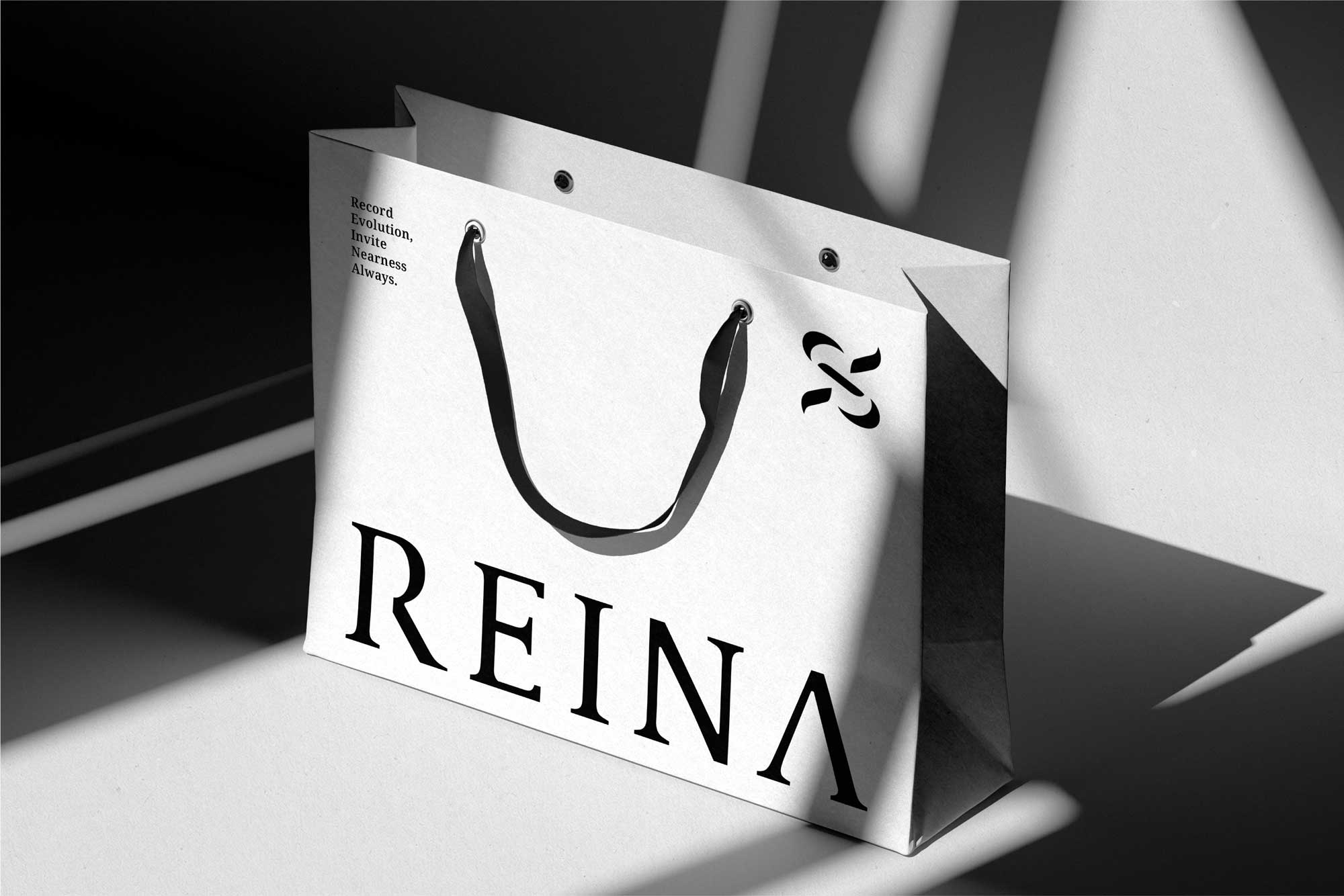
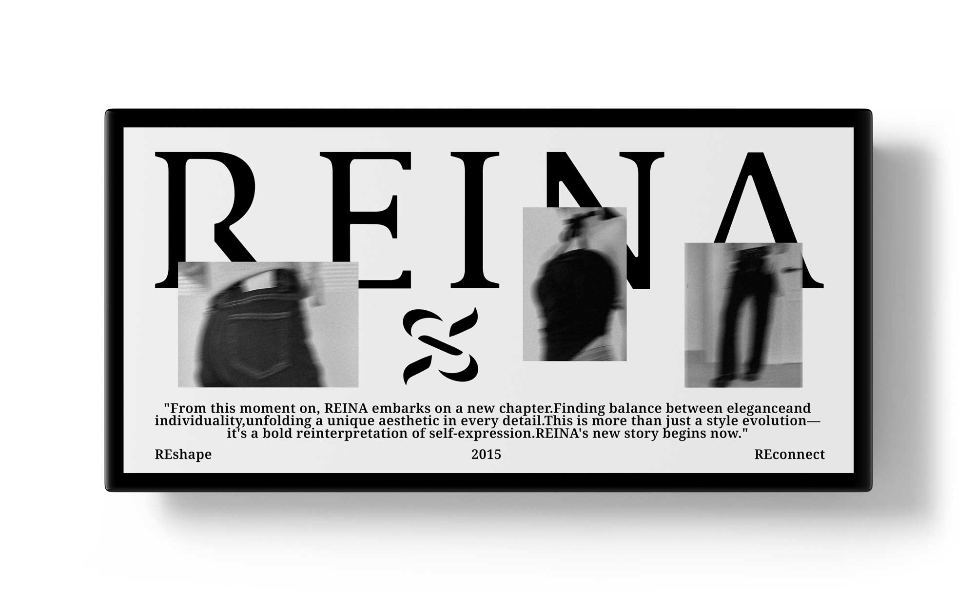
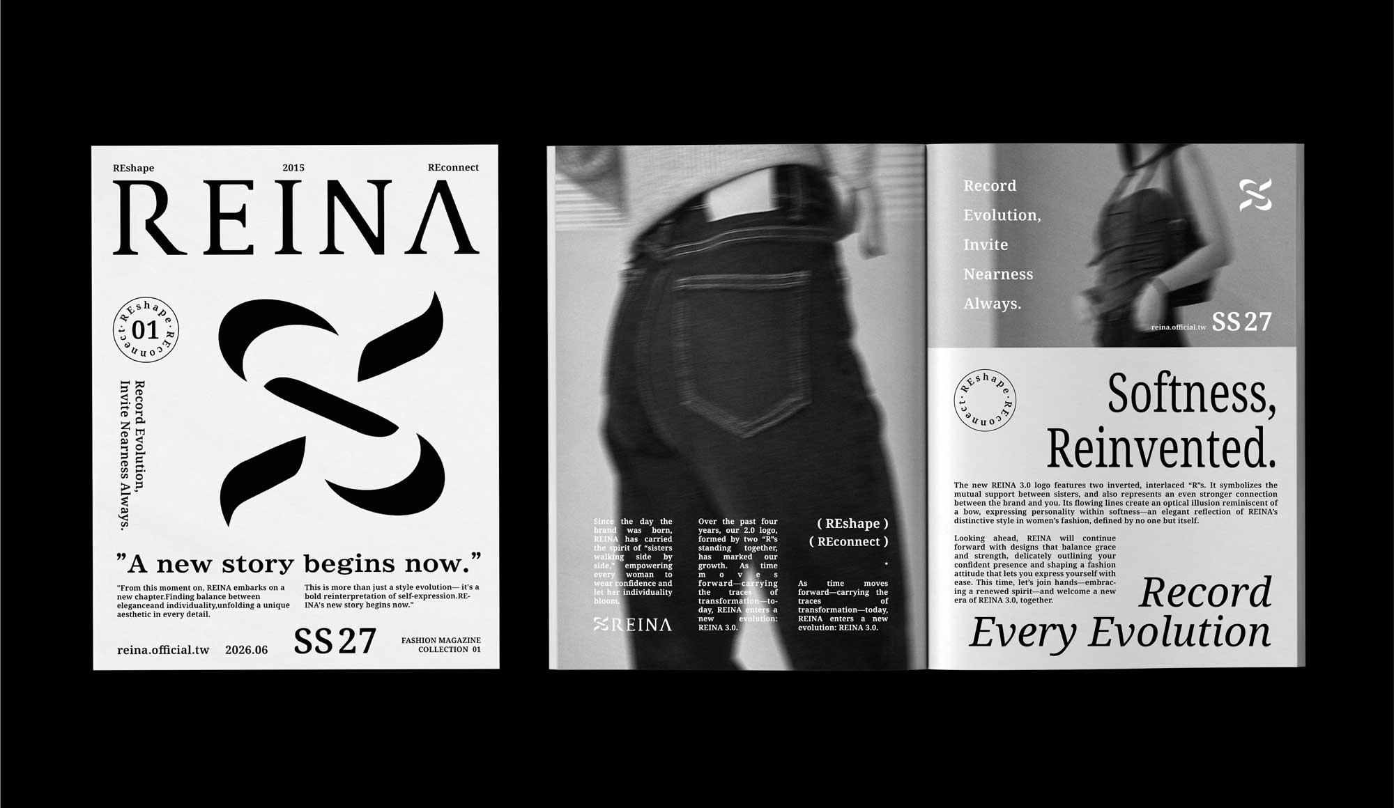
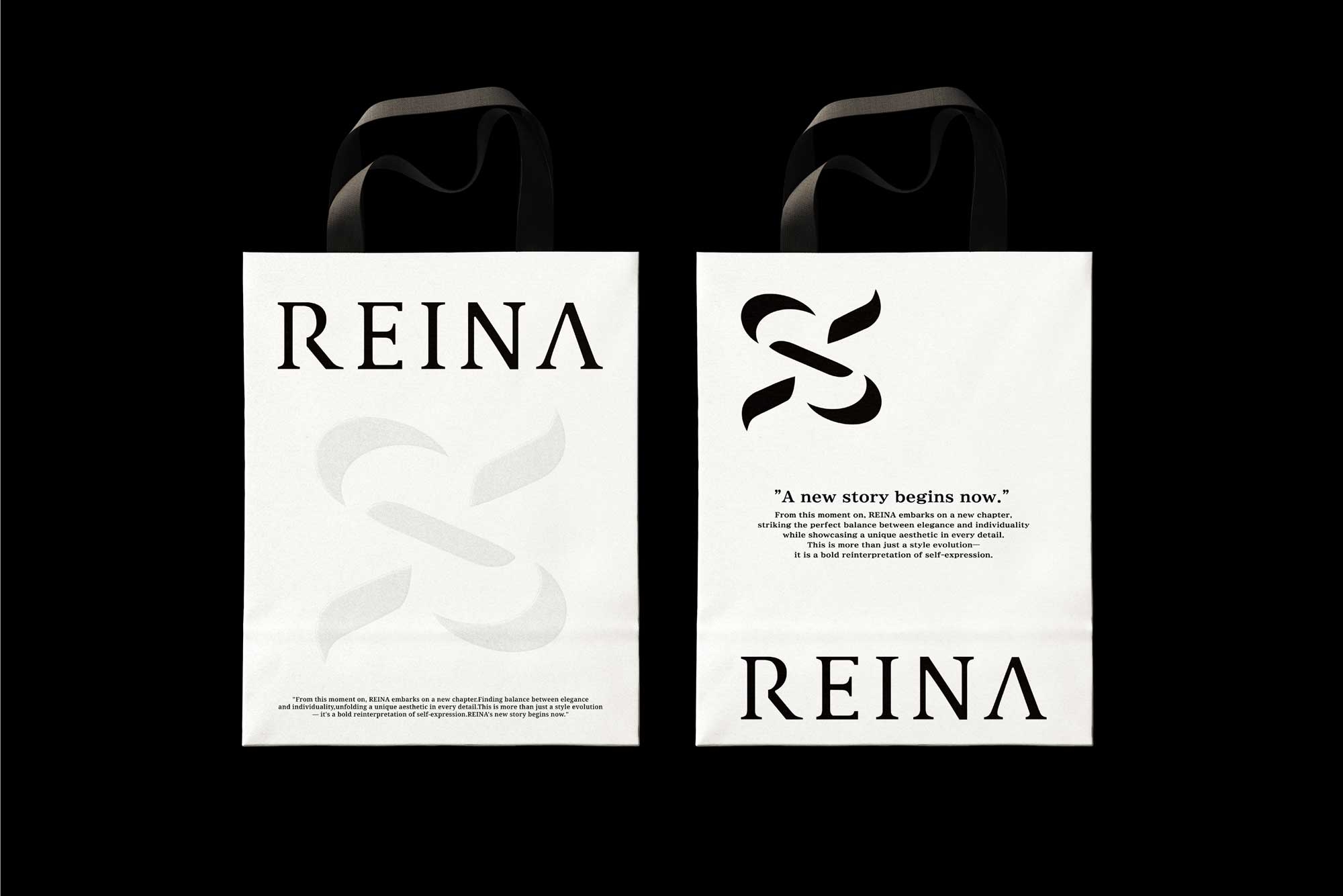
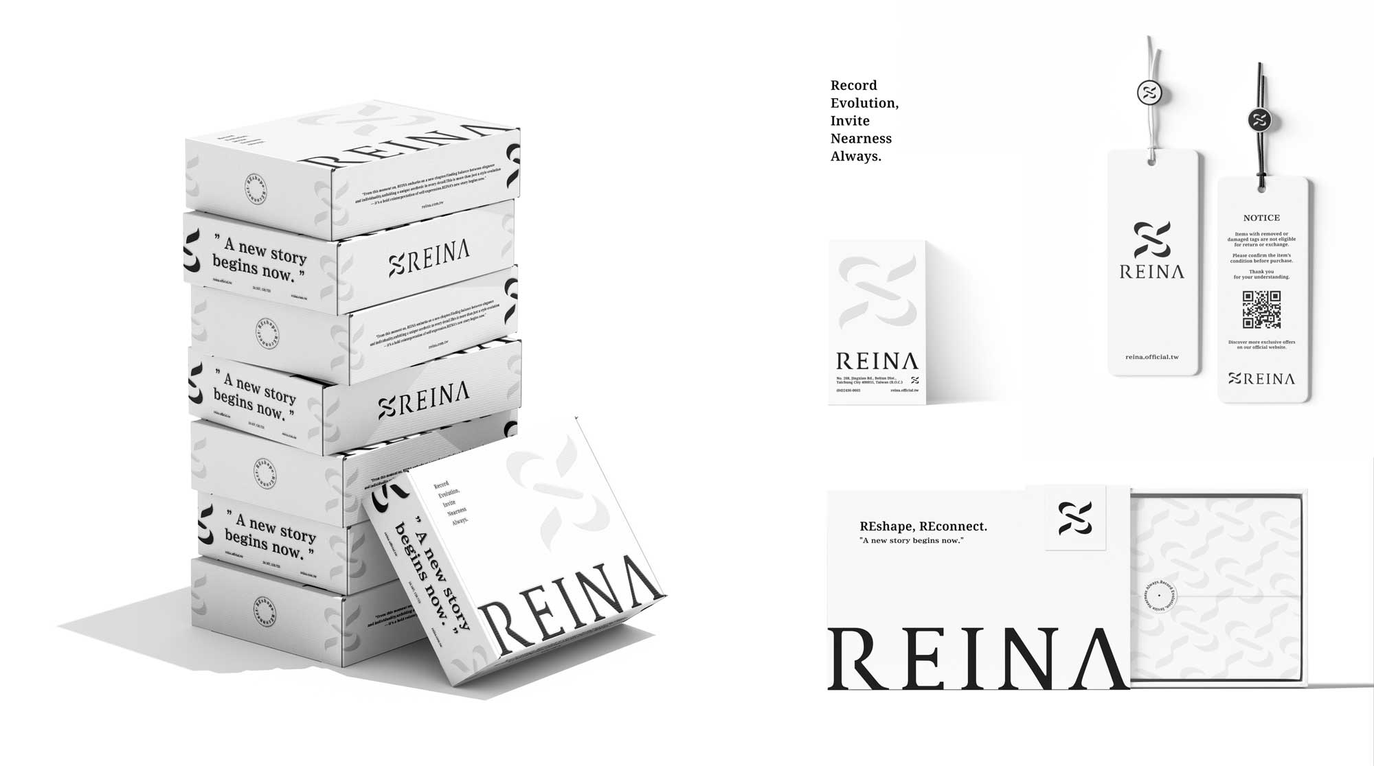
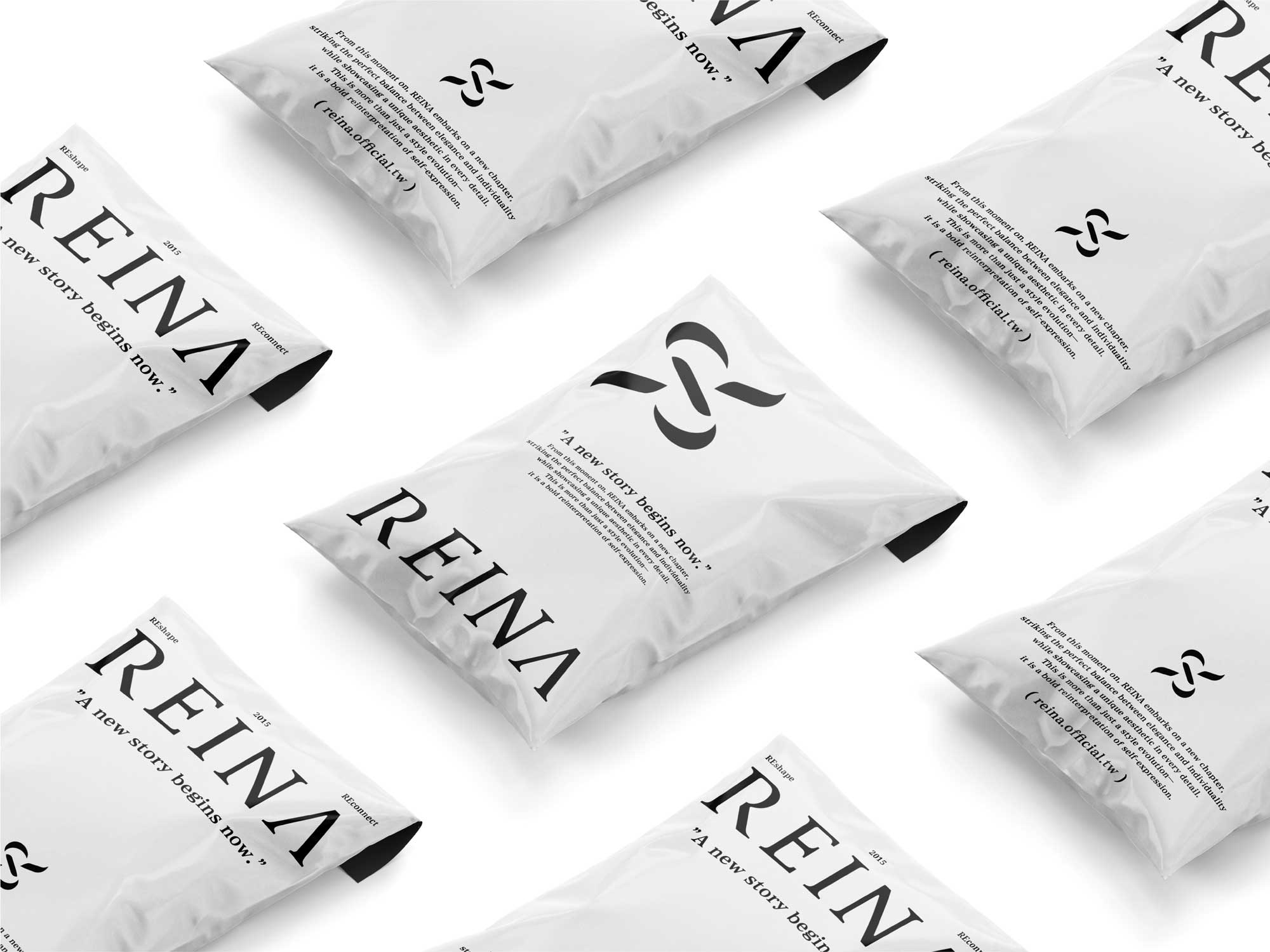
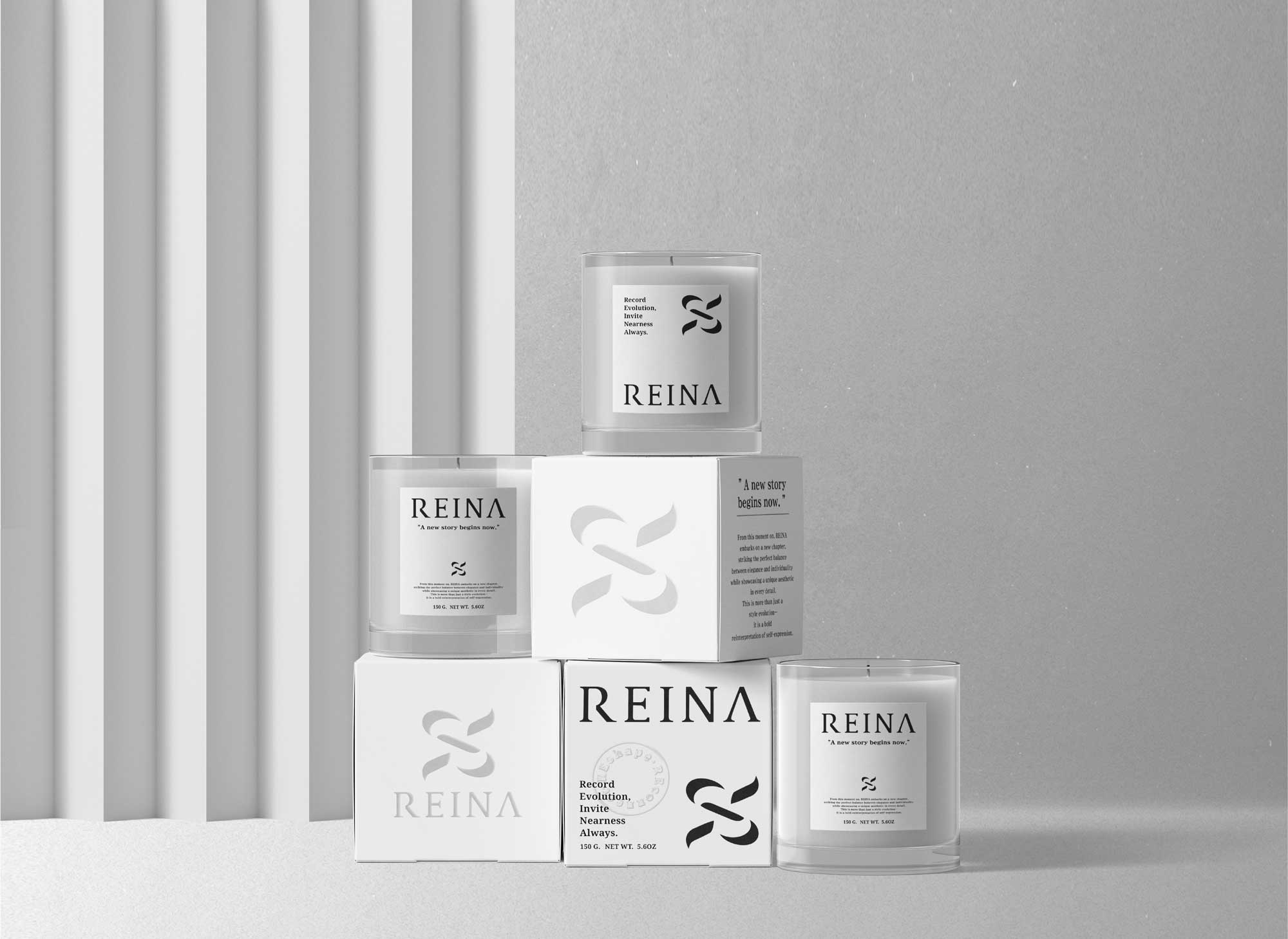
以兩個倒置交錯的「R」為識別核心,
交錯結構回應彼此扶持的力量,
流動線條隱含蝴蝶結般的柔美意象,
在剛與柔之間,建立 REINA 更鮮明的品牌性格。
本次的品牌升級,不僅是視覺上的進化,
更是完整地詮釋
當代時尚與女性精神的品牌樣貌。
感謝業主信任。
Brand evolution is never just about changing how things look.
It’s about redefining the relationships and values that shape the brand itself.
“Every transformation brings people closer.”
For REINA’s new identity, we revisited the brand’s ten-year journey and distilled its core values—
understanding, support, and connection between women.
The visual system is built around two inverted, interlocking “R” forms.
The crossing structure reflects mutual support,
while the flowing lines subtly suggest the elegance of a bow.
Balancing grit and grace,
the mark defines a sharper and more distinctive character for REINA.
This renewal goes beyond a visual update.
It reflects the spirit of contemporary fashion and modern women.
#品牌設計 #品牌行銷 #品牌顧問 #商業空間 #包裝設計